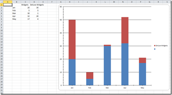
In my last post I showed how to write data to an Excel file using the EPPlus library. I this post we will look at a more advanced topic, how to create a graph on an Excel worksheet.
We will start by using the same code as in my last post to create a new workbook, worksheet, and then add some sample data to it.
using (var package = new ExcelPackage())
{
var workbook = package.Workbook;
var worksheet = workbook.Worksheets.Add("Sheet1");

worksheet.Cells["C1"].Value = "Widgets";
worksheet.Cells["C2"].Value = 20;
worksheet.Cells["C3"].Value = 5;
worksheet.Cells["C4"].Value = 30;
worksheet.Cells["C5"].Value = 32;
worksheet.Cells["C6"].Value = 17;

worksheet.Cells["B2"].Value = "Jan";
worksheet.Cells["B3"].Value = "Feb";
worksheet.Cells["B4"].Value = "Mar";
worksheet.Cells["B5"].Value = "Apr";
worksheet.Cells["B6"].Value = "May";
In this sample data we have labels in column B and values in column C. The first step in creating the chart is to create a new chart object in our worksheet, we do this with the AddChart function:
var chart = worksheet.Drawings.AddChart("chart", eChartType.ColumnStacked);
AddChart takes two parameters, the first is a name for the chart and the second is the type of chart. EPPlus supports a large number of different chart types, in this case we will use a stacked column (bar) chart. Next we need to add a data series to our chart:
var series = chart.Series.Add(“C2:C6", "B2:B6");
The Series.Add function takes two parameters. The first specifies a range of cells that will be used for the values in the series, so we set this to C2:C6 which contains our numeric data. We skip C1 since it contains the column label, we will come back to this in a minute. The second parameter specifies a range of cells that contain the labels for our X-Axis, so we point this to B2-B6 which contains our month names.
If we were to run this now the series would end up with a default name in the legend of the chart. We can fix this using this line:
series.HeaderAddress = new ExcelAddress("'Sheet1'!C1");
With the HeaderAddress property of the series we can set which cell we want the name of the series to come from. Note that for this to work you must specify the full address of the cell including the sheet name. If you leave out the sheet name the name of the series will remain blank.
Since this is a stacked column chart we can add more then one series. If we had additional numeric data in column D we could create a second series like this:
var series2 = chart.Series.Add("D2:D6", "B2:B6");
series2.HeaderAddress = new ExcelAddress("'Sheet1'!D1");
One thing that is missing from EPPlus is the ability to change the style (color, etc.) of a series, you have to stay with the default styles.
The final step is to save the workbook:
package.SaveAs(new System.IO.FileInfo(@"c:\temp\demoOut.xlsx"));
If you run this you will get the following results:

14 comments:
is it possible to add series labels? How to do it?
Yes, you can do it as I describe in the article by setting the HeaderAddress property of the series to the cell where the name should come from.
series.HeaderAddress = new ExcelAddress("'Sheet1'!C1");
Or you can set the name directly with the Header property.
series.Header = "Series1";
Do you pick the colors for the graph or is that something you can set
The graph is drawn with default colors, but you can change them.
Can I label the axes?
Yep..
chart.XAxis.Title.Text = "Month";
chart.YAxis.Title.Text = "Quantity Sold";
You are also a bunch of other properties on Title that allow you to format the labels any way you want.
How to Change Bar color in Bar Chart
Thanks! Do you know how I would add horizontal threshold lines using EPPlus? I found this, but idk how I would do it with EPPlus.
Hello,
There is option Available to Set the Chart legend On Left Top Or anywhere of the chart?
It doesn't give you total control of the position, but you can move it to different sides like this:
chart.Legend.Position = eLegendPosition.Left;
You can also allow it to overlay the legend over the graph like this:
chart.Legend.Overlay = true;
Hello, with EPlus v5.1, the graph is plotted without axis labels.
Axis are present, ticks are there but no label for month and axis values.
I'm not able also in excel to set them visiible (or re-set them).
Do you know how to plot them?
You can get the axis labels back by setting the style on the chart like this:
chart.StyleManager.SetChartStyle(OfficeOpenXml.Drawing.Chart.Style.ePresetChartStyle.BarChartStyle1);
I haven't been able to figure out exactly what properties you would need to set on the chart to have the label appear without having to apply the style.
Looks like the problem is that the font color for the Axis labels is being set to white by default, so you can't see the labels. You can fix this with:
chart.XAxis.Font.Fill.Color = System.Drawing.Color.Black;
Solved.
I don't know why but it is a problem of Font Size.
When I set the size, the Axis text appear.
Post a Comment